Parasite Zero
Postmortem: Level Design
greetings, this is Jaedon Wallace
For this project I was in charge of level design. I Also helped with player leading, enemy design, Level backgrounds, and created some materials.
Level Design:
Main Level:
In terms of level design I originally overestimated the amount of work we could do with time we had. The whole area was just meant to be one section, where I would add more similar sized sections later. It was designed as loop where the player would go through complete a task and then return to the main hub area. Then in the main hub, they could go back-and-forth like Dishonored/BioShock completing sub tasks. This was scraped because the team decided that this section was already big enough for all the time we had. Definitely the right choice for everyone's sanity including mine. This design was also made before we finalized what our game was going to be like. Our final game ended up being linear, but the level I had designed was more open-ended. So I had to convert to fit our actual game. I feel like this is the biggest issue with the level design and why it has trouble leading the player, since originally they were meant to explore. This is why there's one section on the very far end of level that can just be completely skipped with no consequence.
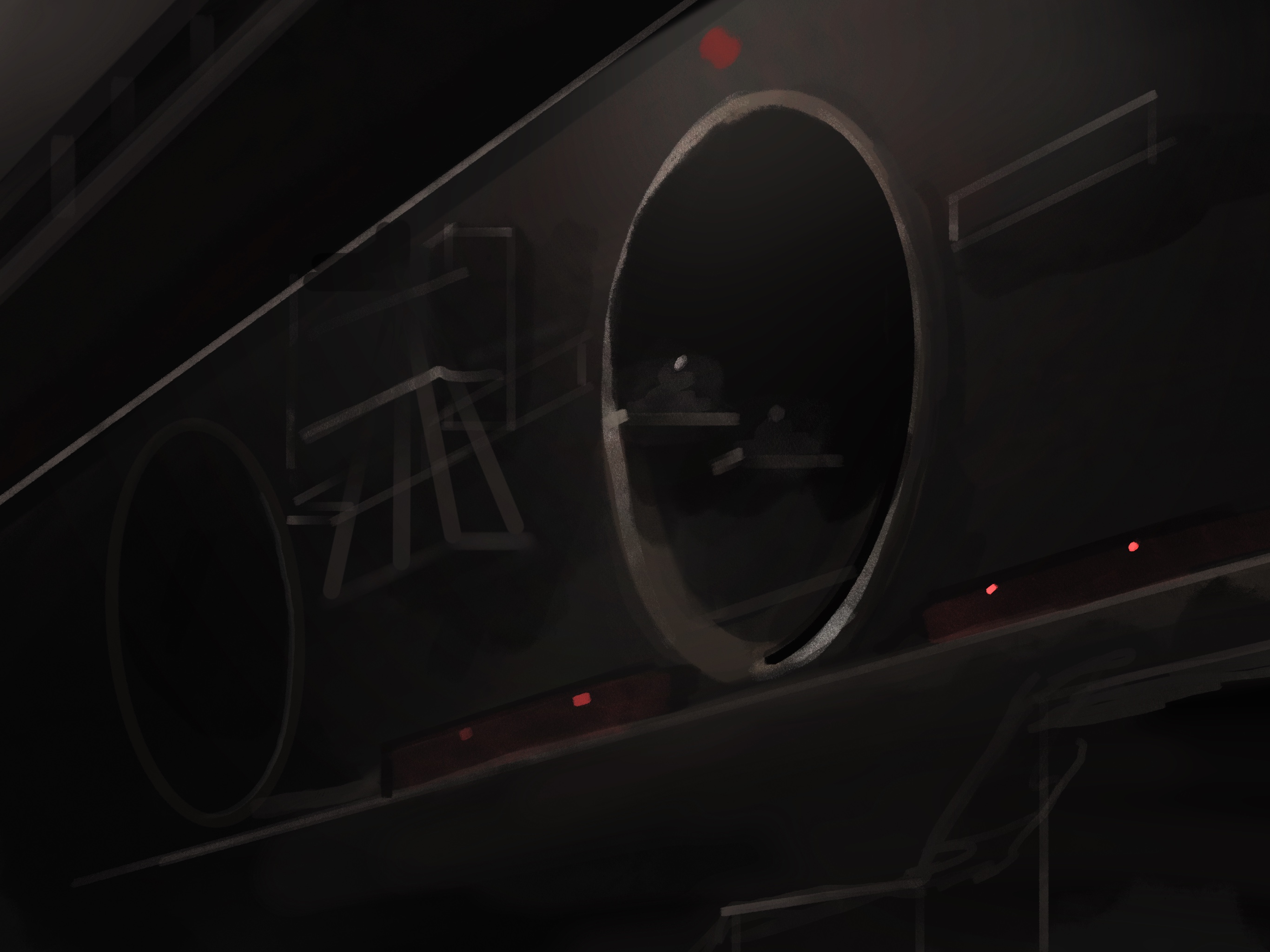
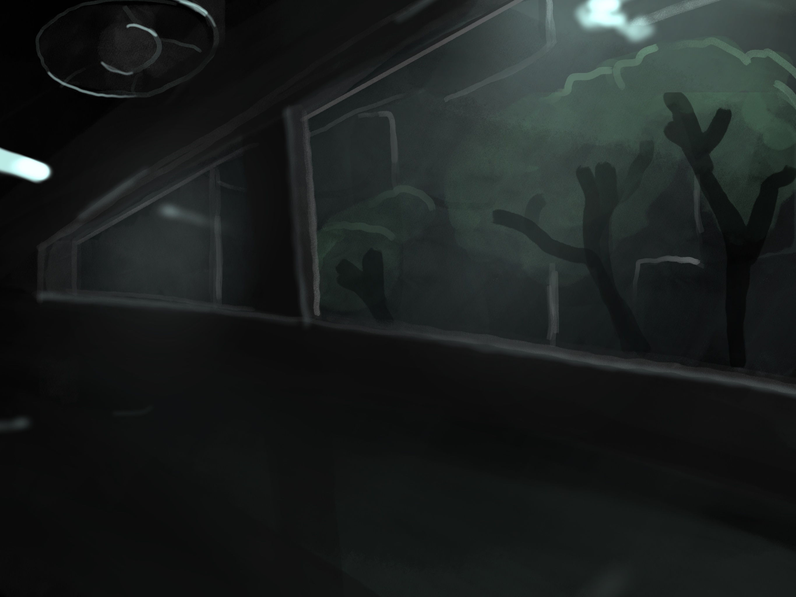
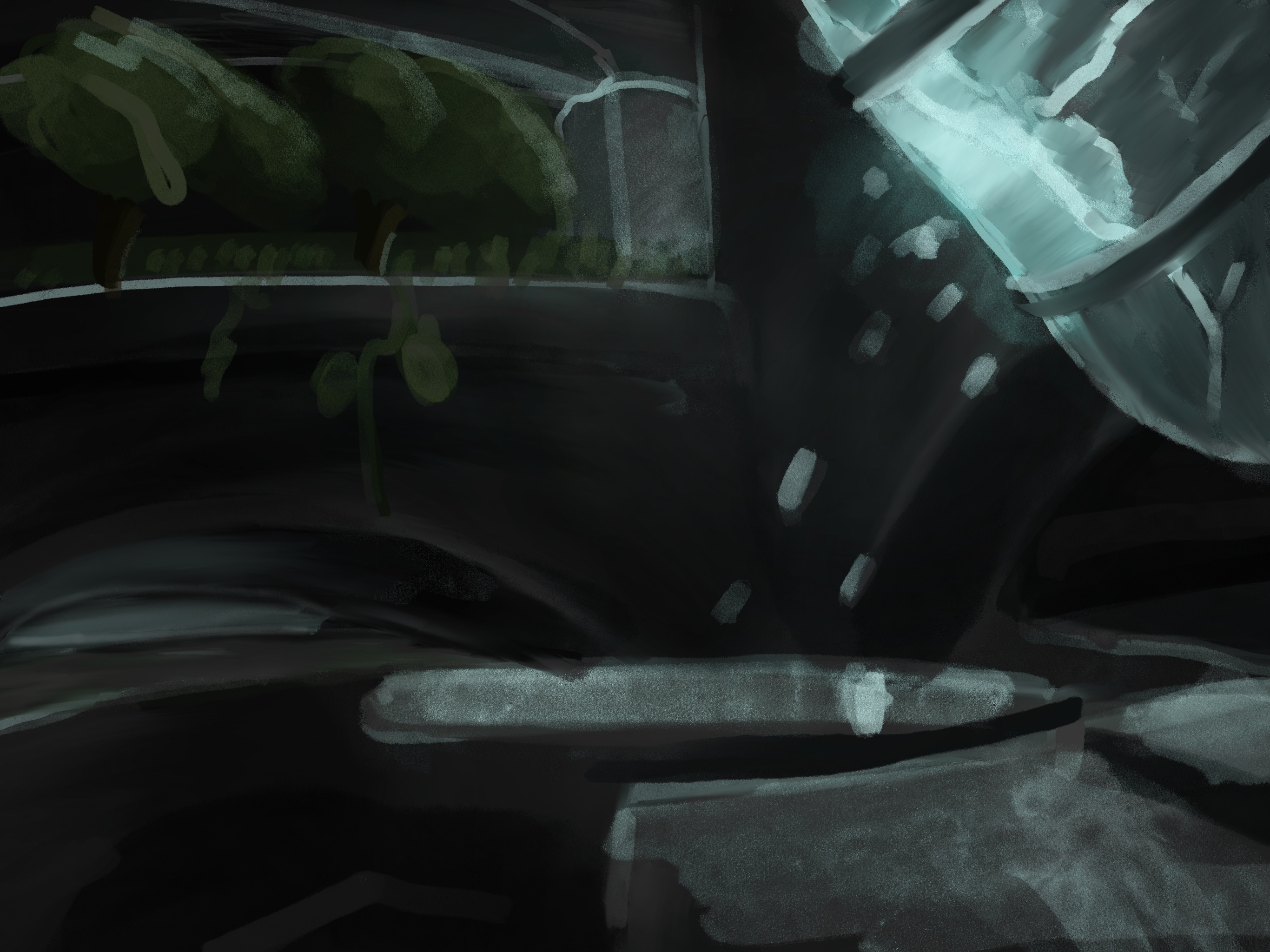
Originally there were supposed to be different environments for the player to explore, this level being the industrial area. But once we realized that this level is already massive, we just had to add hints of the different areas into this level. You can see this with how the upper floors have more plants.
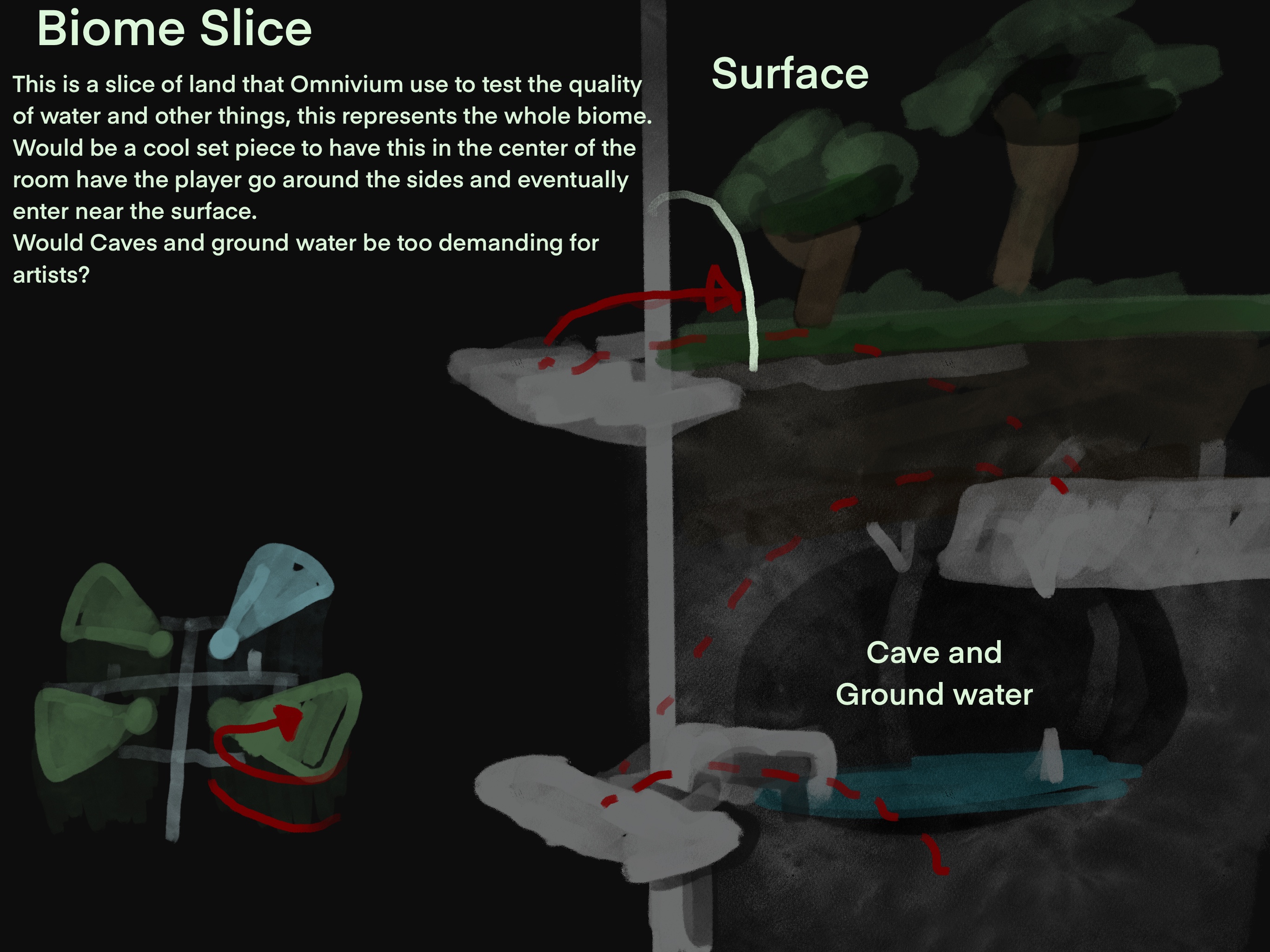
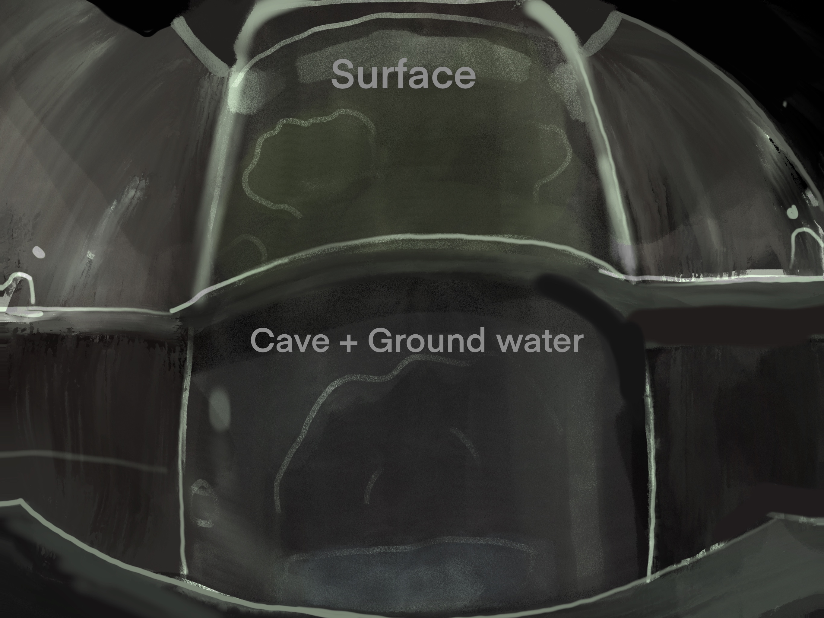
You can see my concept art for these areas. They are intentionally dark and fuzzy just to inspire ideas until we figure out what we wanted. We still had to keep within limitations of what asset packs we had available. originally I wanted a puzzle where we had a giant cylinder that was a sample of a biome or an environment, the player would have to rotate it to get to different rooms. This was scrapped because the level was already massive.
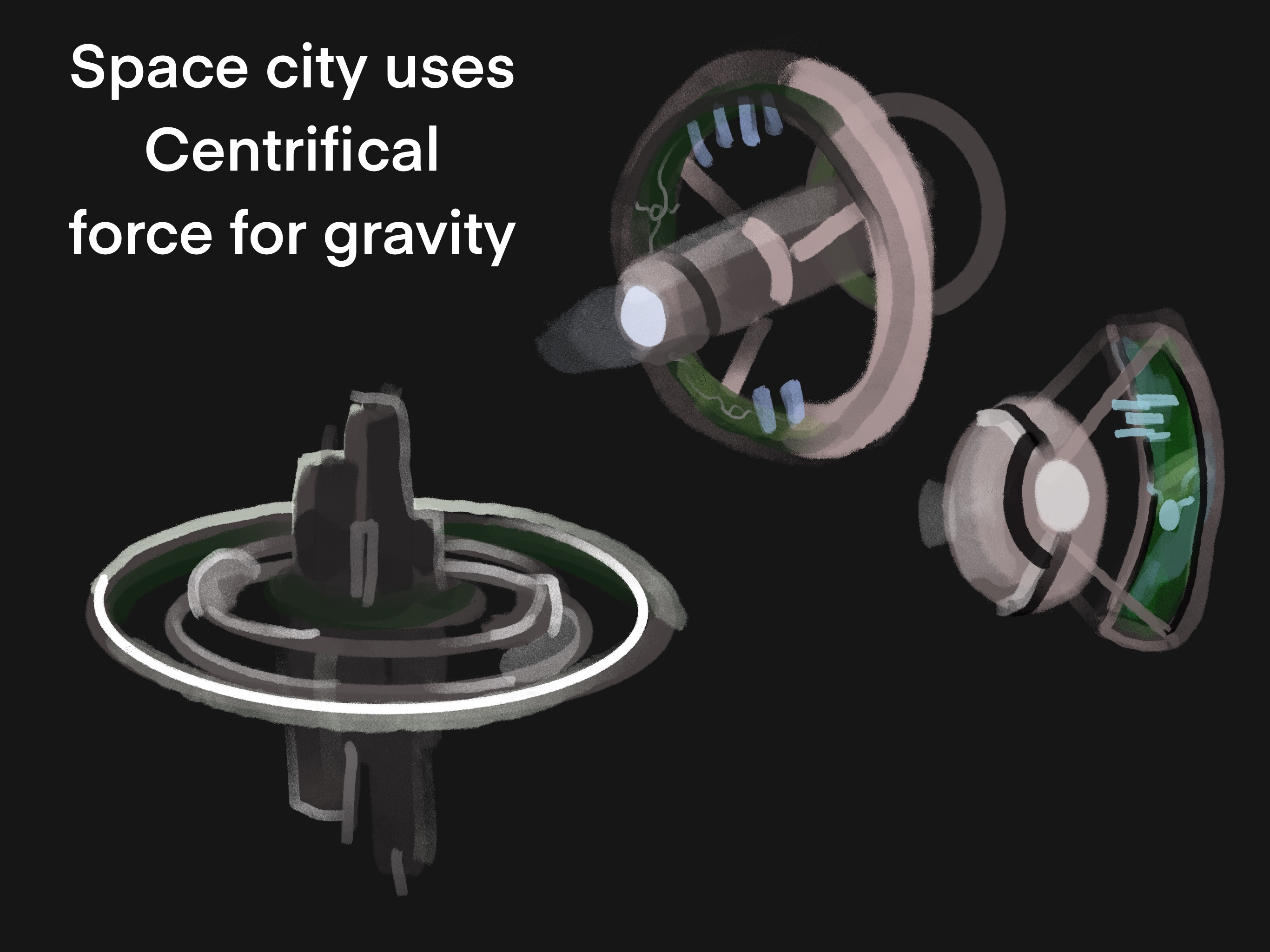
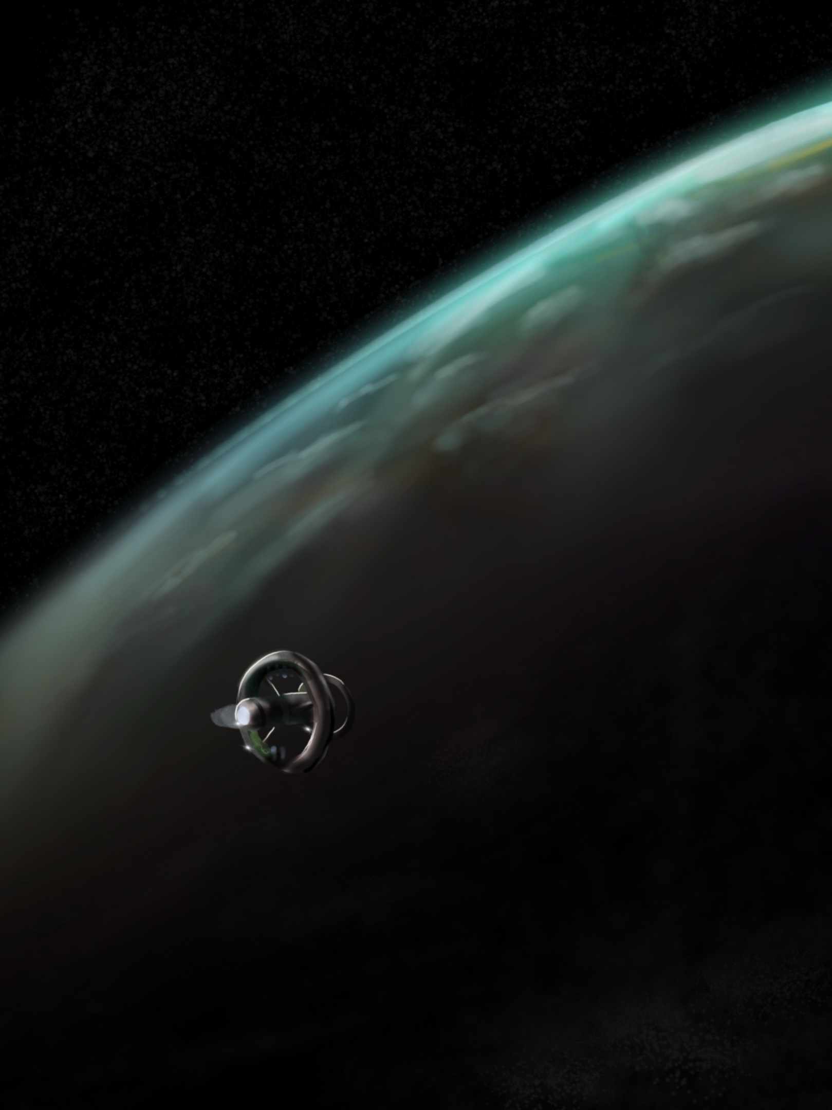
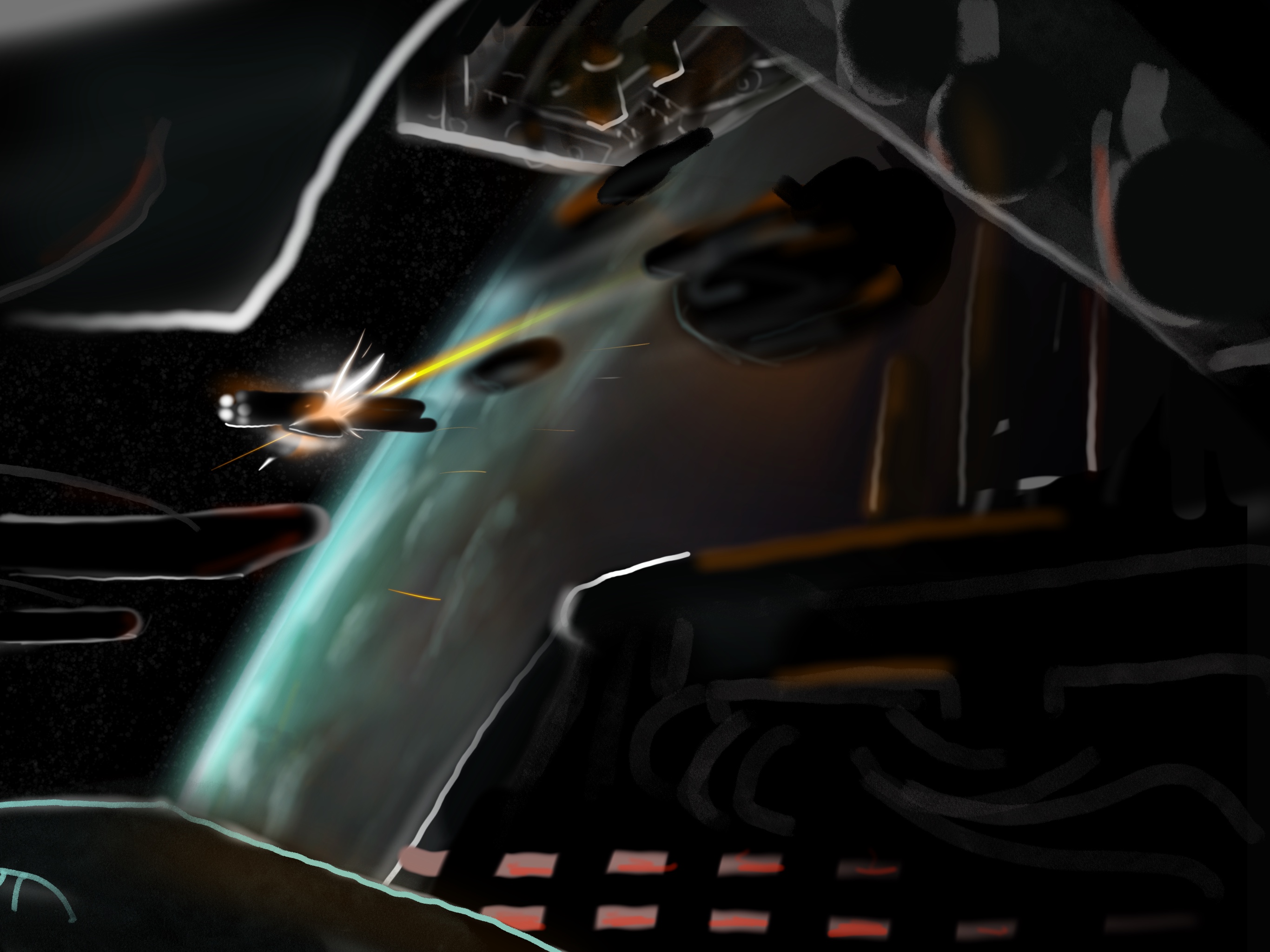
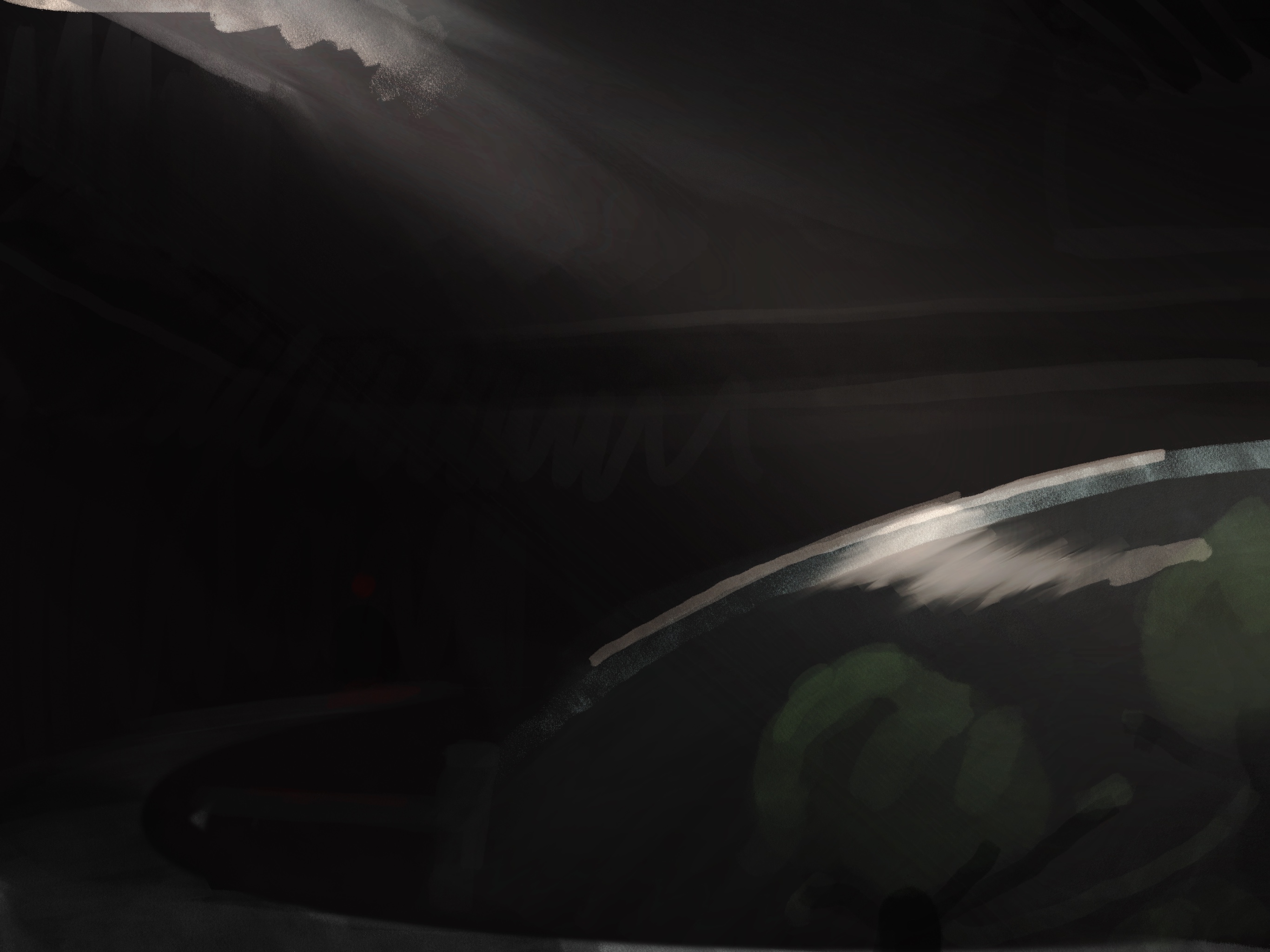
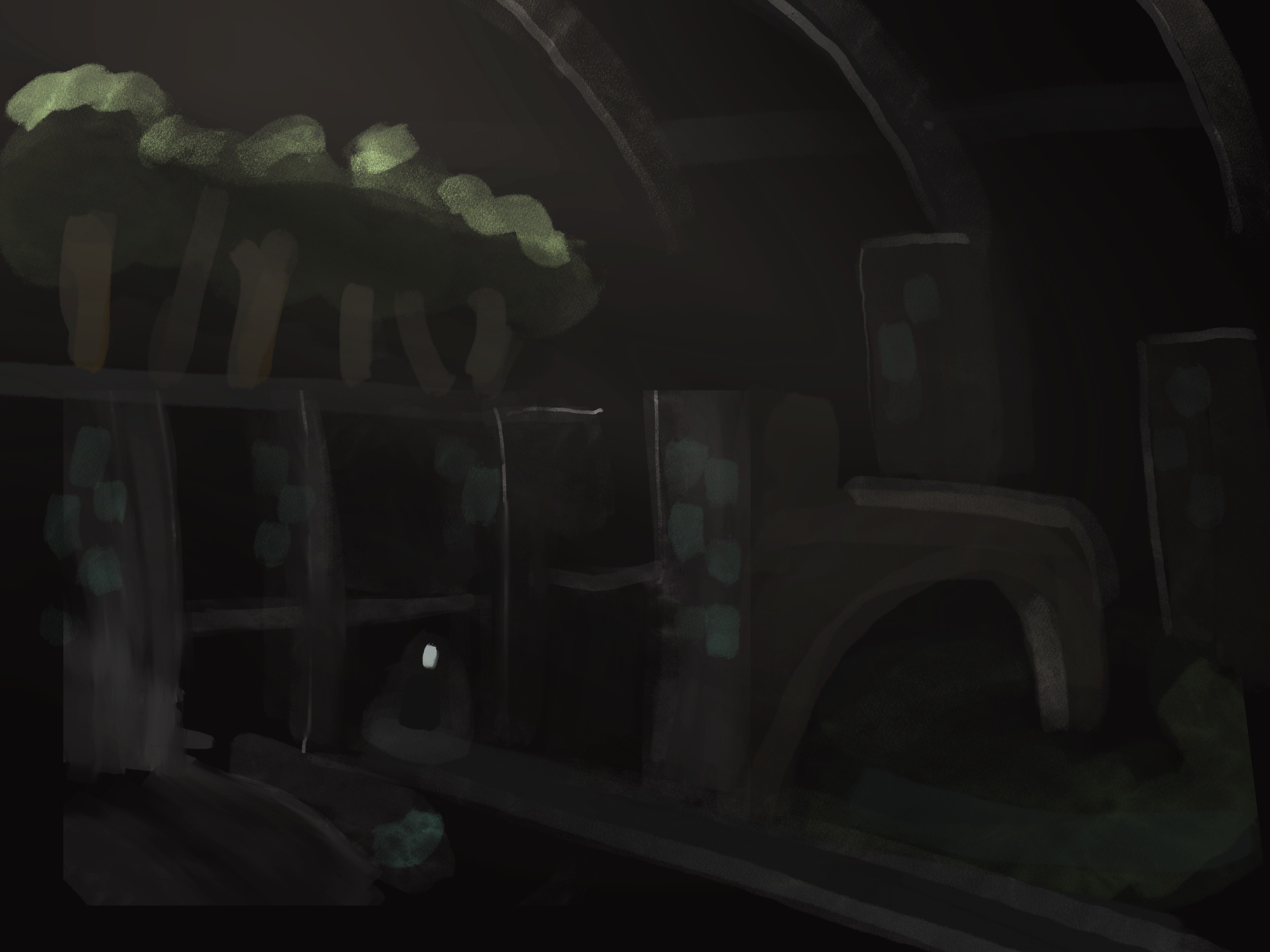
The backdrop for the level that is in game I'm pretty happy with. It's meant to make the player feel small and insignificant. So I have these huge vistas and this dark tan fog. However somewhere along the lines post with post processing, it got really dark and hard to see.
With what actually got in game, I feel like I am pretty happy with the puzzles for the sound lure. However since the player being able to sprint there's no reason to actually participate in the puzzles. These sections were designed for the player to throw a sound lure to a specific place or across the room so that's an enemy would turn away, then the player could go and backstab. If you play these sections slowly, you can still participate in the design I intended. I thought for a while about just removing the sprint. But we decided to just roll with it because we're running out of time.
Definitely what I need to work on most is player leading cause the player has no idea where they need to go. I slapped a Band-Aid on this by putting a bunch of signs with numbers up. (Basically yellow paint)
In the future, it would be nice to actually know what the game is before I'm tasked with making a level. So I should probably also start with smaller levels that are just one encounter, so we can decide what the game is. Then once we decide. Then I make the full size level.
Boss Level:
I actually have two version of this. A really big level where you would go and shoot these anti-air turrets and pop these giant monster eyes so that you are effectively killing the level itself. I'm really proud of this design I feel like it well uses all of the aspects learned in the main level. Also, since I knew the level was going to be linear I did a lot better job at player leading by using lights, shadows, and set pieces. However our art team said it was too big for the time we had . (Though I tried to intentionally designed to just be a few cat walks with the background doing heavy lifting) so I made a way smaller version of the level but I still use the same background I made.

For the background of the boss level. I created this web like structure that uses the meaty material I made for Nanite. However I quickly learned that just doing this was not good for performance. So I chopped up the web model into around 16 chunks that the game could easily cull un-viewed sections. After I did this, the performance still wasn't that great. After some investigating i learned that it was Nanite overdraw. so to fix this, i placed underneath the displaced Nanite mesh, a secondary non-Nanite mesh. you can view this secondary mesh if you go to low graphics settings. This secondary mesh very effectively stops Nanite overdraw, since it acts as an occluder, this brought performance back to a reasonable state. I find it kind of weird that Unreal doesn't do this by default.
Design:
Part of my job as design was implementing the code that code team made and getting it in game. This ment making sure doors worked, making sure items were placed in the right area, and spacing out the collectible Zubs so their audio had enough time to play before the next one. I would play test for the game make sure each section works if it was playable and try to find soft locks.
I helped with the design of how the enemies should work. I created simple videos and diagrams showing how they should interact with the player so that the sound lure puzzles could work.
I feel like we should've limited the range of the grapple hook. This one have allowed us to make a smaller level, if the level is smaller then the player wouldn't have to run, if the player didn't run they could actually participate in my noise lure puzzles.
Art:
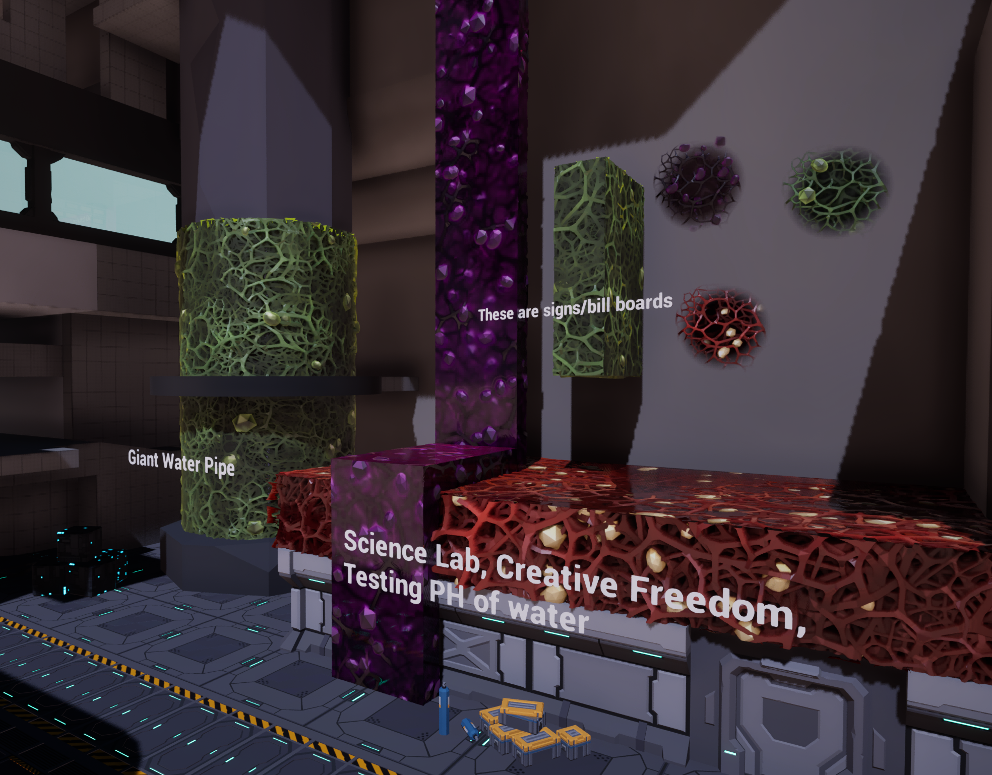
I made the materials and decals for the purple wall climb, the green grapple and the meaty red surface. These use Nanite tessellation and displacement, they were designed to look low poly but detailed to fit the assets already in game. I created this by first modeling a webby model in blender, I then rendered it to a height map wich i used in substance designer to make the materials. I reused this webby model in game and you can see it placed throughout the level.
I wanted these materials to look distinct from each other even if you're colorblind. So green is more mossy and rough, purple is supposed to look like jelly or jello, and red is darker with bits of blood pooling to add reflections. For visual flair, I actually baked the specular highlight onto the texture itself. I'm really proud of these materials, they look tasty!
Leave a comment
Log in with itch.io to leave a comment.